rrcf
🌲 Implementation of the Robust Random Cut Forest Algorithm for anomaly detection on streams
View the Project on GitHub kLabUM/rrcf
Theory
• Related work and motivation• Tree construction
• Insertion and deletion of points
• Anomaly scoring
Basics
• RCTree data structure• Modifying the RCTree
• Measuring anomalies
• API documentation
• Caveats and gotchas
Examples
• Batch detection• Streaming detection
• Analyzing taxi data
• Classification
• Comparison of methods
Streaming anomaly detection
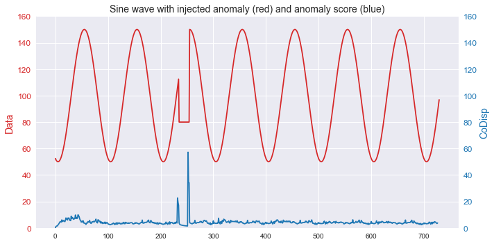
This example shows how the algorithm can be used to detect anomalies in streaming time series data.
Import modules and generate data
import numpy as np
import rrcf

# Generate data
n = 730
A = 50
center = 100
phi = 30
T = 2*np.pi/100
t = np.arange(n)
sin = A*np.sin(T*t-phi*T) + center
sin[235:255] = 80
Construct forest of empty RCTrees
# Set tree parameters
num_trees = 40
shingle_size = 4
tree_size = 256

# Create a forest of empty trees
forest = []
for _ in range(num_trees):
    tree = rrcf.RCTree()
    forest.append(tree)
Insert streaming points into tree and compute anomaly score
# Use the "shingle" generator to create rolling window
points = rrcf.shingle(sin, size=shingle_size)

# Create a dict to store anomaly score of each point
avg_codisp = {}

# For each shingle...
for index, point in enumerate(points):
    # For each tree in the forest...
    for tree in forest:
        # If tree is above permitted size...
        if len(tree.leaves) > tree_size:
            # Drop the oldest point (FIFO)
            tree.forget_point(index - tree_size)
        # Insert the new point into the tree
        tree.insert_point(point, index=index)
        # Compute codisp on the new point...
        new_codisp = tree.codisp(index)
        # And take the average over all trees
        if not index in avg_codisp:
            avg_codisp[index] = 0
        avg_codisp[index] += new_codisp / num_trees
Plot result
import pandas as pd
import matplotlib.pyplot as plt
import seaborn as sns

fig, ax1 = plt.subplots(figsize=(10, 5))

color = 'tab:red'
ax1.set_ylabel('Data', color=color, size=14)
ax1.plot(sin, color=color)
ax1.tick_params(axis='y', labelcolor=color, labelsize=12)
ax1.set_ylim(0,160)
ax2 = ax1.twinx()
color = 'tab:blue'
ax2.set_ylabel('CoDisp', color=color, size=14)
ax2.plot(pd.Series(avg_codisp).sort_index(), color=color)
ax2.tick_params(axis='y', labelcolor=color, labelsize=12)
ax2.grid('off')
ax2.set_ylim(0, 160)
plt.title('Sine wave with injected anomaly (red) and anomaly score (blue)', size=14)